1. Word Assignment--Create a design in which you use several different shapes. Give them the 3-D and shadow effects. Make them so they are in perspective and all lead to one location. When you go to the 3-D box there is a box that says 3-D settings. This will help you turn the boxes into perspective. Call it 3-D perspective.
- 2. NEW Create an eye
chart using different sizes of the same font. Use a quotation that
will be suitable. Wikipedia is a good location for some quotes on such
subjects as art. Start by finding a quote. Go into word and type
the quote. Then remove all the spaces between the words. Select
the line and enlarge it to 72 point print. Take the amount on the
first line and select the rest of the quote. The next line is 48 point
print. Keep that line and then select the rest of the quote.Create
that in 36 point print. Continue with that procedure until all the
lines are used. Also, center the quote. Be sure to give credit to the
author of the quote. Note the example of the project below.Call
the assignment Eye Chart
Aworkofart
Whichdidnot
Beginine
Motio
Nisno
tart
.Cezanne
6. Wordle.net--Try this program--Go to WWW.Wordle.net Insert some writing into the box which asks for text. (Consider a composition you may have written.) When you have done this, click on go. In return for your work, you will receive a graphic called a word cloud. The most common words will be the largest words. Call your work Wordle.net It needs to be printed. Do not save to the public gallery.
**********************************************************************
Photostory
7. We will next be creating a video and musical photostory. YOu will first need to find pictures on one topic. Think of one topic that may be good for a class you may be taking. I don't want facebook type pictures. For instance, consider a story using landscape pictures from South Dakota or Germany. Try to get at least 25 pictures. Also, find information about the pictures and take note of that information. You will be using that as a part of your presentation. Place this in a photo folder named photo folder. Call this Photo Story 1( This program is easy to use. After you open the program, import the pictures and follow the "next" prompts.
8. Create a second Photo Story--this time with serious intent. Think of a subject that could be used in one of your classes. Include text, music and lots of photos. Put in several movement effects and vary your timing. Make this the "best ever photo story" in your opinion--300 points. For instance, a photostory could be created which centers on the various vice presidents of the United States. Add music and pertinent facts that would be relevant to the topic and to the class. This is required.. Photostory 2--
************************************************************************
Remember to save all your work as jpegs and also put your initials after the name.
Photoshop
It is time to start Photoshop
- Create a file in your graphics file called Photoshop and your initials.
- Then go to the start menu and the all programs menu. Go to the Adobe Photoshop and allow it to open. This will take a few minutes.
- Listen to the information provided by your instructor to allow you to get to know the desktop more thoroughly.
- Experiment with the icons you learned from that lecture. More information will be provided during the explanations the second class period.
- Assignment--create several examples of work you have created using the more simple tools. These are experiments meant to help you just explore the site a bit more. Call these experiments exp1, exp 2, exp 3, exp 4, etc. Also, don't forget your initials.
///////////////////////////////////////////////////////////////////////////////////////////////////////
To enter the program choose Start Start>All Programs>Adobe Photoshop CS4. You may also click the icon on the desktop screen. close the welcome screen when it appears.
remember--when you open a photo, make a copy of the background. YOu will not be able to add anything to the background and you will be terribly frustrated..
When the program is loaded, you will see a a page with several toolbars and palettes. On the left side are several icons which are the main tools you will be using. If you go to any of the icons, you may see a small triangle in the lower right corner of the boxes containing the icons. By clicking on that triangle, you will find a new box which will appear with new choices of tools.
After clicking an icon, look at the toolbar on the top of the page. If you click brushes on the left toolbar, a toolbar will appear which has brushes tools. You may choose new brush menus, change the size of the brushes, determine how heavily the "paint" will flow from the brushes and how opaque the paint will be. This sort of situation applies to all the tools on the left side.
*************************************
On the right side are a set of palettes. The ones you will be most likely to use are the color palette and the layers palette. If you do not see these areas, go to the list of pulldown windows menu at the top of the page. The list on the menu will include areas such as color and layers among others. To see an area, click on the name of the palette you wish to see.
1. Go to file>open and open a photo (Maybe a picture of yourself) that you may have somewhere on your u drive. Go to image on the top tool bar and click rotate 90 degrees left. save as 90 left
2 Click edit> undo rotate and go to image>flip horizontal. Save as flip horizontal
3. edit>undo flip horizontal---go to the crop image on the tool bar on the left side of the screen. The icon looks like two intertwined boxes. Select the areas you wish to keep by using the crop tool to select those areas. Then click and the areas not selected will disappear. Then, click the check mark if you like the selection or the circle with the diagonal line if you do not. Call this cropped image 1
(The checkmark and the circle are at the top of the page. The circle means that you do not want to keep the work. The checkmark means that you want to keep that work. Until you click one of these buttons, you will not be able to move forward with your work.
4.Edit>undo crop ---Do the same as above and crop out only one image. Click the check mark if you like your work. If not, click the circle and try again. Call your work Cropped iImage 2
5.Edit>undo crop--Go to image>mode>Grayscale. Say "yes" to discard color information. This will change your picture to a grayscale photo. Save your work as Grayscale.
6. Edit>undo Grayscale.
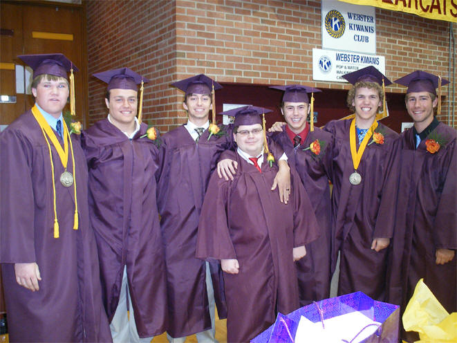
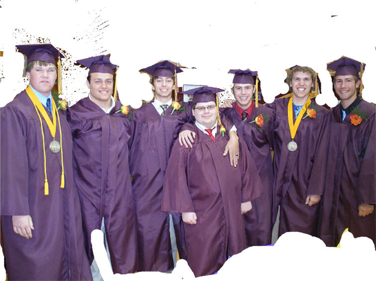
Go to the tool bar on the left side of the screen. Choose the tool that looks like a magic wand--about the 4th tool down. Hold the wand over an are of the picture that you would like to remove from the picture. This will result in the areas of that color chosen to be selected. Click delete and the area chosen will disappear. (If it looks as though nothing happened, go to the background layer and turn it off. You should have just the areas left that you did not choose. Call this magic.
 +
+ =
= You may
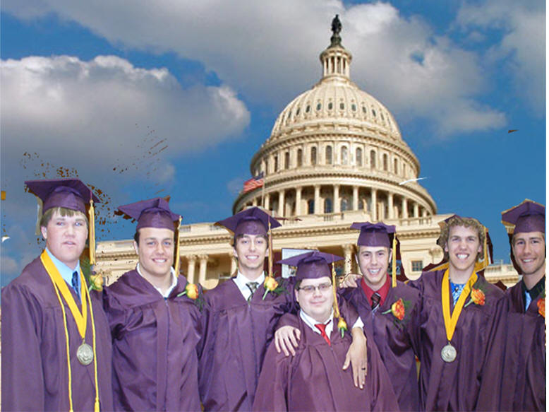
ask why we would do this--removing the background from a picture. Now, imagine that you want
a picture of yourself on the moon.
If you get a picture of yourself, remove all the background using the magic wand
tool. (Remember that you will not be able to do anything on the background
layer.) Then. put a picture of a landscape from another area into the
picture as the layer located under the picture of you. (You will be able to
do this by opening a photo--file>open>whatever picture you choose> After
you open the picture, make a copy of the background layer. Click on TWO UP
at the top layer. Drag the landscape over to the layer with the people.
Be sure the people are on top of the landscape. (Resize both pictures so they
fit in proper proportion on your picture.) Now, you can find
yourself in another area of the world or the universe without leaving home.
Call this picture MOON
7. edit>undo
Transform---This is extremely important for you to learn-Go to edit>free transform. Your entire picture will be selected. Grab one of the corners and you will be able to pull in your picture to change the size. This may not seem important now but it will be extremely important if you want to change sizes of your pictures. Be sure to click the check mark if you want to save this size. Otherwise, click the circle. Call this free transform.
8. edit>undo
Go to edit> transform>skew. On the tool bar at the top--3rd row down--there is a box that looks like a square with two boxes tilted at two angles. Click on this box. Now grab a corner and move to the side. You will be skewing your picture. Call this SKEW
9. Edit>undo SKEW
Keep your same image. go the the edit>free transform>distort. Click on distort in the image menu. go to your picture and grab a corner to create a distorted version of your picture. Call this distort.
10. Edit>undo Distort.
Do the same thing with the perspective tool and call this perspective. (Don't forget to click the check mark.)
11. Edit>undo perspective.
- >>>>>>>>>>>>>>>>>>>>>>>>>>>>>>>>>>>>>>>>>>>>>>>>>>>>>>>>>
- Now, open a new picture. Do not close the previous picture but minimize it.
- Select this new picture and edit>copy. Minimize this picture and maximize the first picture.
- Click the layer tool on the layer palette. This will create a new layer.
- Turn on the new layer to make it active. Edit>paste. (This will result in two layers sitting on one palette waiting to be both be seen on one picture.)
- To do this, make sure the third layer is turned on (blue) and that layers one and two are both visible (both of the eyes should be visible.)
- Then go to the opacity tool on the layers palette. If you change the opacity of the top picture, you will be able to see both the top and bottom pictures. Save this and call it two layers.
-
- >>>>>>>>>>>>>>>>>>>>>>>>>>>>>>>>>>>>>>>>>>>>>>>>>>>>>>>>>>>>>>>>>>>>>>>>>>>
- 14.To see what happens when the layers are reversed, take your cursor over layer 1 and a hand will appear. Keep your left mouse button down and move your layer one to the location used by layer two. Notice that layer two disappears because layer one was still opaque. Now, change layer one's opacity and layer two will appear. Keep the eye turned off on the background. Call this layer reverse.
- >>>>>>>>>>>>>>>>>>>>>>>>>>>>>>>>>>>>>>>>>>>>>>>>>>>>>>>>>>>>>>>>>>>>>>>>>>>
- 15 Then, using the layer reverse picture, turn on the background eye. Notice that the opaque background may make a difference in the quality of the picture. Call this lrb. (This stands for layer reverse background.)
- >>>>>>>>>>>>>>>>>>>>>>>>>>>>>>>>>>>>>>>>>>>>>>>>>>>>>>>>>>>>>>>>>>>>>>>>>>>>>>>>>>>>>>>>>>>>>>>>>>>>>>>>>>>>>>>>>
- 16. Using the drawing tools, create a 4 layer picture. Make the picture have all four layers visible. (hint: use the transparent background when you open your drawing palette.) Then move the layers to different locations to create four, four layered pictures. Call them four layer 1, 2, 3, and 4. This means that you will have four separate pictues--each done in a different order of layers.
- >>>>>>>>>>>>>>>>>>>>>>>>>>>>>>>>>>>>>>>>>>>>>>>>>>>>>>>>>>>>>>>>>>>>>>>>
- 17. Attempt to use the text box and text tool to write your name in a creative way. Experiment with 5 different versions of your name. Call this 5 names. (In the near future we will use a tool that will lead you to places you never expected to experience with script.)
- 18. Using what you may have learned from doing the words, you will need to define and illustrate an appropriate word of your choice. Call this Definition (required)
- >>>>>>>>>>>>>>>>>>>>>>>>>>>>>>>>>>>>>>>>>>>>>>>>>>>>>>>>>>>>>>>>>>>>>>>>>>>>
- 19. REQUIREDTry to experiment
- to maintain color and turn the rest of the picture to black and white
- Do this by finding a color picture.
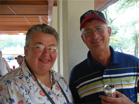
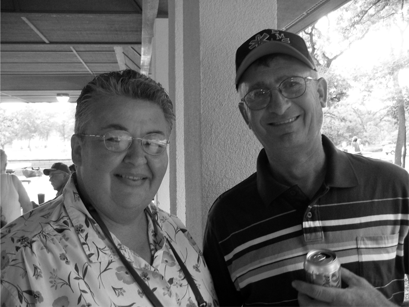 Make a copy of the picture. Go to image>admustments>hue/saturatation.
Go to saturation and slide the bar to the left until that top layer turns
black and white.
Make a copy of the picture. Go to image>admustments>hue/saturatation.
Go to saturation and slide the bar to the left until that top layer turns
black and white.- Use the lasso tool to choose an area
of the top picture. Click delete. You will now have either color peeking through the hole in the top picture.>
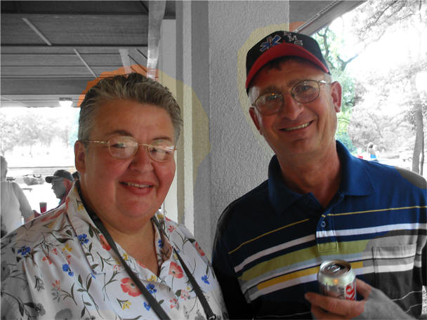
- Notice that the first picture is in full color, the second is all in black and white and the third picture chose the important parts of the picture chose the most important parts of the picture (ok, I'm prejudiced) and put those in color. Call the work bwc (black, white, color) >>>>>>>>>>>>>>>>>>>>>>>>>>>>>>>>>>>>>>>>>>>>>>>>>>>>>>>>>>>>>>>>>>>>>>>>>>>>>>>>>>>>>>>>>>>>>>>>>>>>>>>>>>>>>
- >>>>>>>>>>>>>>>>>>>>>>>>>>>>>>>>>>>>>>>>>>>>>>>>>>>>>>>>>>>>>>>>>>>>>>>>>>>>>>>>>>>>>>>>>>>>>>>>>>>>>>>>>>>>>
- 20. Go to Google.com. Go to about Google and then to the google logos. Study what has been done in the past and see what you can do using your name as the basis for the logo. Your assignment is to create a logo of your name similar to the style of the Google logo. Call it logo 1
- >>>>>>>>>>>>>>>>>>>>>>>>>>>>>>>>>>>>>>>>>>>>>>>>>>>>>>>>>>>>>>>>>>>>>>>>>>>>>>>
- 21. The creation of a logo is one use for text or graphics. A logo is a type of symbol used as an identifying device for groups, businesses, people, etc. Please look at this information concerning the design of logos and what they mean.

There’s a lot of time and more importantly thought that goes into a
development of a good and functional logo.
I have collected some of the
well-known logos with a creative rationale behind their design, which hopefully
will inspire other graphic designers and educate clients. Chances are you will
see at least one of these logos before you go to bed tonight.
FedEx

If you concentrate your attention on the letters “E” and “x”. The negative space
those 2 letters create, form an arrow pointing to the right side. This signifies
forward or moving forward and this is what the company does.
Adidas

The shape of 3 stripes on the Adidas Logo represents a mountain, pointing out
towards the challenges that are seen ahead and goals that can be achieved.
Amazon

The logo has an arrow pointing from A to Z. This signifies that they sell
everything from A to Z. The arrow also forms a smile.
Apple

The apple is a reference from the Bible story of Adam and Eve, where the apple
represents the fruit of Tree of Knowledge, with a pun on ” byte/bite”. Rob
Janoff, said in an interview that though he was mindful of the “byte/bite” pun
(Apple’s slogan back then: “Byte into an Apple”), he designed the logo as such
to “prevent the apple from looking like a cherry tomato.”
Audi

The four rings, which make up the Audi logo, represent the four companies that
were part of the Auto-Union Consortium in 1932. They were DKW, Horch, Wanderer
and Audi.
BMW

The BMW medallion represents a propeller of a plane in motion, and the blue
represents the sky. This is because BMW has built engines for the German
military planes in World War II. The colors are the national colors of
Bavaria, which now forms a part of Germany. (Email update by: Christoph Lauber)
IBM

If observed closely, the IBM logo, also known as “Big Blue”, generates a message
of “Equality”. The Big Blue IBM logo, with its lower right parallel lines,
highlights in the shape of an “equals” sign. Furthermore, the term “BIG” in the
Big Blue IBM logo refers to the company’s size in the market share, whereas, the
“BLUE” is the official color of the eight-bar IBM logo.
McDonalds

The idea of ‘arches’ was first introduced by Dick and Mac McDonald as arch
shaped signs on the sides of their then ‘walk-up hamburger stand’. From an
angle, those arches looked like the letter “M” and thus, were incorporated in
the McDonalds logo as a merger of the two golden arches together.
Mercedes-Benz

The star in three corners represents the Mercedes-Benz dominance on land, sea
and air.
Mobil

A simple typeface was used to attain exuberance and vitality. Red, being the
intense color, evokes the strength and blue builds up a feeling of faithfulness
and security for the company.
Volkswagen

The simple logo icon contains the letters V and W: “volks” means “people” and
“wagen” means “car”.
Toyota

The Toyota logo contains three ellipses, which represent the heart of the
customer, the heart of the product and the heart of technological progress and
limitless opportunities of the future. In Japanese, “Toyo” signifies abundance,
and “ta” means rice. In some Asian cultures, the rice represents wealth.
Puma

The Puma logo has an image of a leaping Puma, an animal otherwise
called a cougar, a panther or a mountain lion. Active both day and night, it is
a powerful beast and an expert hunter that can jump to a maximum of 20 feet high
in a single bounce. By incorporating the creature in the Puma logo, the company
has summarized the complete meaning of its products into a powerful identity.
The Puma logo itself characterizes the brand’s reliability and its products’.
Fantastic logos with a hidden meaning
admin
Mon, 08/01/2011 - 10:04
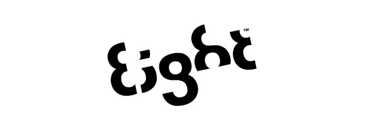
This logo was made by Stylo Design, a design agency from Covent Garden, London.
The entire logo is created with only one number; the number 8. By omitting
certain parts of this number, they were able to create the brand name.

At first all you see is modern typography, but there is actually a hidden
meaning of Sony's VAIO logo. The first two letters represent an analog signal
and the last two are the 1 and 0 of the digital world.

Here of course an arrow is hidden between the letters E and X. Lindon Leader
designed this famous logo in 1994, as Senior Design Director at Landor
Associates, San Francisco. It was a result of a work where more than 200 logos
were designed before the designer arrived to this solution. It won over forty
logo awards worldwide.

Eighty-20 is a small consulting firm. The squares actually a binary code for the
name. Top line: 1010000 and on the bottom: 0010100.
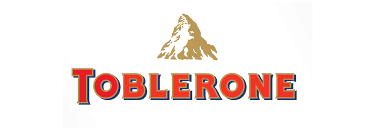
Toblerone chocolate company from Bern, Switzerland, which is known for high
mountains. Bern is also called "The City Of Bears". Find the hidden silhouette
of a bear in the mountain illustration.
Baskin Robbins offers 31 flavorous of ice-cream. The number 31 is hidden in the
logo within the letters of B and R.

The Northwest Airlines logo has two hidden meanings. For one it has the letters
N and W in positive and negative spaces. And there is another less apparent idea
in there. The red triangle points to north-west within the circle as if it was a
compass.
The SUN Microsystems logo is a wonderful example of symmetry and order. It
was a brilliant observation that the letters u and n while arranged adjacent to
each other look a lot like the letter S in a perpendicular direction.
The Tostitos logo has a not so hidden message. The letters TIT are two actually
people enjoying mexican food at a table.

The Formula 1 logo has a hidden number 1 between the letter F and the speed
lines.

Elefont is another logo with a hidden meaning in the negative space. Find the
trunk in the lowercase letter e.

The feathers of this peacock represent the 6 different divisions of NBC. The
head is visible suggesting the peacock is looking toward the viewer.

It is one of the biggest European retailers, and in French, it means
"Crossroads". The logo symbolizes this word via two opposite arrows. They also
added the first letter of the name, because if you look closely you’ll see the
letter "C" in the negative space between the two arrows.

The C and O letters at the beginning of the word shape a tyre, which Continental
produces.

Unilever produces literally thousands of different products, thus the letter U
is made up of symbols representing all these products and what they mean to
their consumers.
This was a logo created for a puzzle game called Cluenatic. This game involves
unravelling four clues. The logo has the letters C, L, U and E arranged as a
maze. and from a distance, the logo looks like a key.
Families is a Readers Digest magazine. The letter "ili" are transformed to show
a simplified and stylised family of three.

Goodwill is a nonprofit organization that helps disadvantaged people in North
America. The letter G in the logo is a smiling face, conveying the notion that
Goodwill provides happiness and relief to those in need.

At first glance, this logo looks like a map of Africa, but if you take a closer
look, you will see two people facing each other.

Conceptual logo that shows a golfer taking a swing and the head of a spartan
warrior in helmet at the same time.

The Bronx Zoo logo shows the animals within a city with tall building. Smart
play with positive and negative spaces.

Snooty Peacock is a jewellery store. Notice the hidden peacock in the face.

The Hartford Whalers logo shows 3 concepts at the same time. A whale's tail,
letter “W” in green and the white space forming an “H” for Hartford.

The designer of ED Logo – “Elettro Domestici -Home Appliances” in English,
changed the concept of traditional logo designing through this logo. The
designer has amazingly used the negative space to demonstrate the letter “E” and
“D” making the logo look like an electric plug.

In this Yoga Australia logo you can discover the shape of Australia in the
negative space formed between the woman's raised leg and back.
Notice the palm of a hand in this MyFonts logo made out of the letters M and y.
Finally here is a logo designed in-house for some internal event at IBM.
**************************************************************************************************************************************************
- 22 Now for your assignment--Create a logo for your name in a style that is
significant to you. YOur design must not be even close to an existing
logo--it must be unique to you. Call your design
LOGO.


- 23.Then create 3 variations of the logo.
The reason for the variations can be purely a result of economics.
Printing in color or very large can be effective but very expensive.
Still, the business wants to have its logo out there for the public to see.
You will want to create versions of the logo that may be suitable for a
billboard, on clothing, on your letterhead and on your return address or on
the side of your delivery van or on your webpage.
Black and white can be very effective for the uses that do not require
color. Call this logovar 1,
logovar2, and logovar3.
- >>>>>>>>>>>>>>>>>>>>>>>>>>>>>>>>>>>>>>>>>>>>>>>>>>>>>>>>>>>>>>>>>>>>>>>>>>>>>
- Now, for a fun assignment--choose a room you would like to redecorate. Go to this website--http://www.adobe.com/education/digkids/lessons/revamparoom.html for ideas concerning how to go about redecorating a room. Go to Google.com and find an image of an empty room. Add color, furniture, art, etc. to your design Call this design EMPTY ROOM.
- Add furniture, floor coverings, people, wall treatments, art work--sculptures, posters, etc., windows, doors, window treatments--whatever will make your room interesting. Use the edit transform tool to do such things as skew, perspective, distortion, etc. Also, use your magic wand tool to remove unnecessary backgrounds.
When you feel you may be done, call me over for any guidance I may provide. Then, after you get the ok--but only after the ok--go to Layer>flatten image. (After you close and save, you will not be able to edit>undo so you need to be very sure of your commitment.
You will receive two grades--one for your mechanical work and the second for your decoration of the room.
